I play Pokémon GO every day without exception. I’ve never missed a day since I installed the app on July 9, 2016. I’ve probably spent more time in aggregate playing this game than any other game I’ve ever played.
And I’ve played a lot of games over the years.
Obviously I love the game or I wouldn’t subject myself to this. That being said there are so many areas where I see there could be huge quality of life improvements that would make the daily play of the game so much more fun and less frustrating.
As I said I love the game but it is tedious. Very, very tedious.
Here are what I am identifying as the top improvements that could be made to relieve some of the tedium and leave more time for the fun parts of the game.
1.) Shiny Indication
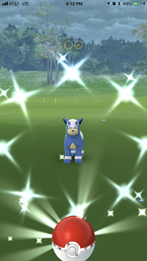
Some Shiny Pokémon are easy to identify. When you tap on a shiny Mareep or Dratini, it’s instantly obvious, even before you see the sparkles fill the screen.
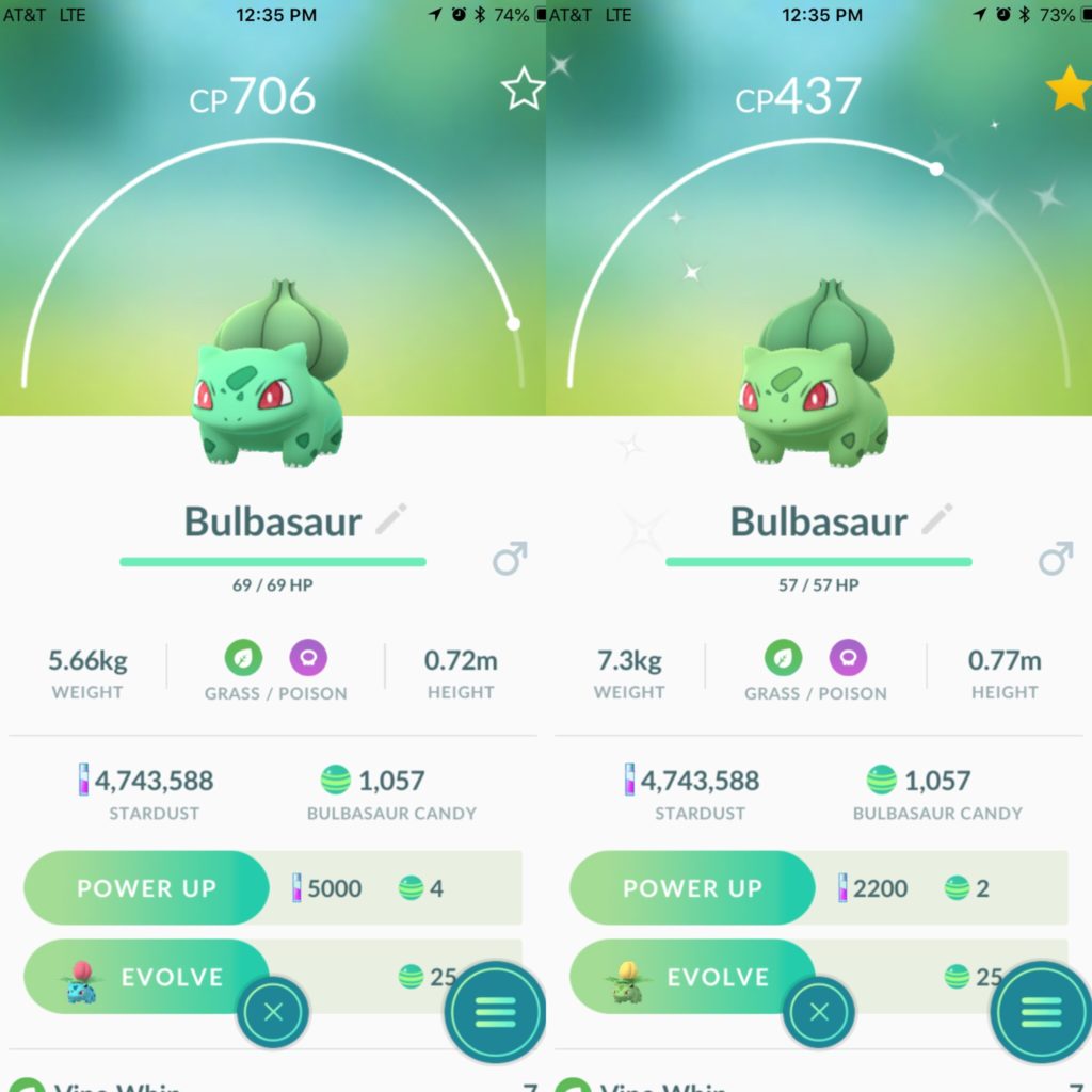
With others, the difference is barely noticeable. During Community Day, where the entire object is to capture a new shiny, you are generally playing outside int he bright sun. It can be difficult to distinguish between a normal and shiny Pokémon in regular light, in the sun it is barely possible. During the three starter Community Day events I caught shiny Pokémon without even realizing it.
It would be great if there was something more to identify a shiny. One option would be to have an icon hover above the Pokémon like with weather boost. My preferred option would just to make the sparkles continuous throughout the encounter, radiating outward during taunts. This would eliminate any ambiguity and lessen the possibility of having a shiny run on you.
2.) Sort/Search by Distance/Location
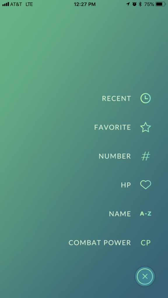
For trading distance is important but when you’re in the trade screen you have no indication of where a Pokémon was caught. Sorting by location would be a great way to easily find Pokémon for the best distance. Perhaps a little readout below each in the list showing the distance caught from current location (e.g. 7km, 150km, 823km, etc.). Perhaps even color coding the tier it’s in (0-10km, 10-100km, 100km+) based on how many candies you’ll be rewarded on distance (1, 2, or 3).
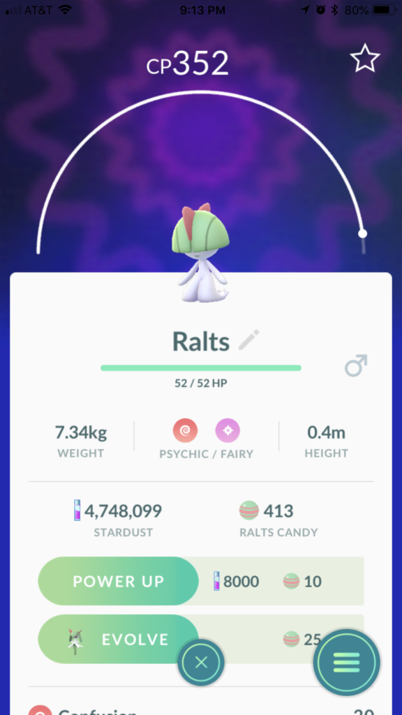
3.) Show Us The IVs Already!
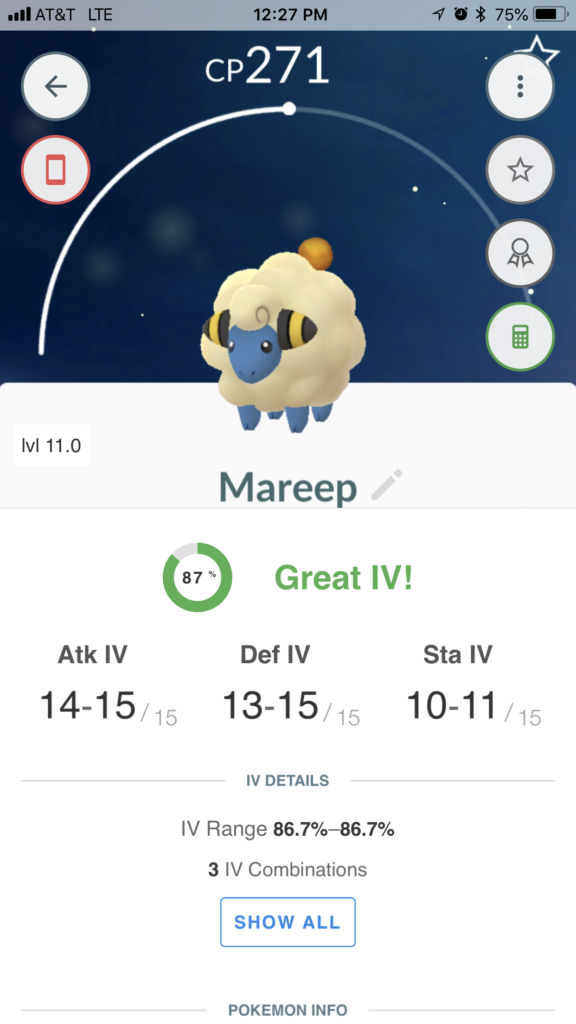
If I had to pick one change I’d like to see in the game, this would be it. Show us the IVs and stats! Show us when we catch a Pokémon so we can quickly make a transfer decision. Show us on the main sorting screen to make bulk transfers quicker and easier. The appraisal system is so incredible tedious and wishy-washy.
As a proud member of Team Instinct I’m subjected to Spark being super misleading with his appraisals. “Room for improvement . . .” “. . . definitely got some good stats . . .” 33%? C’mon, Spark, just be upfront with me and tell me this Natu sucks! I can take it. Are you afraid of hurting my feelings?
Better yet, just give me the exact numbers so I can make a split second decision and move on.
4.) Separate Pokémon Storage “Boxes”
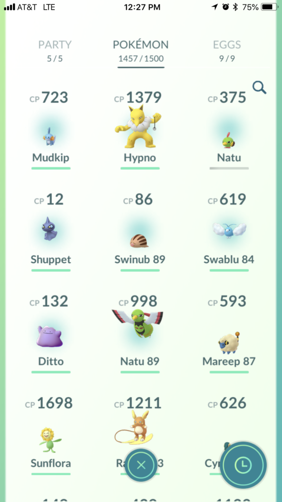
With 1500 Pokémon storage and rumor to be 2000 soon we really need a way to divide up our huge Pokémon inventories. Being able to quickly mark a Pokémon for trade or evolution would be a great way to not have to scroll or search as much. Just hanging out in your evolution box for mass evolutions or jumping into your trading box to trade with friends would make for a much more enjoyable experience. Even having an option to custom name a box (like you can with Battle Parties) would be great. Right now naming all of my Pokémon “Trade” then searching for “Trade” each time is cumbersome.
5.) Nearby Tracking
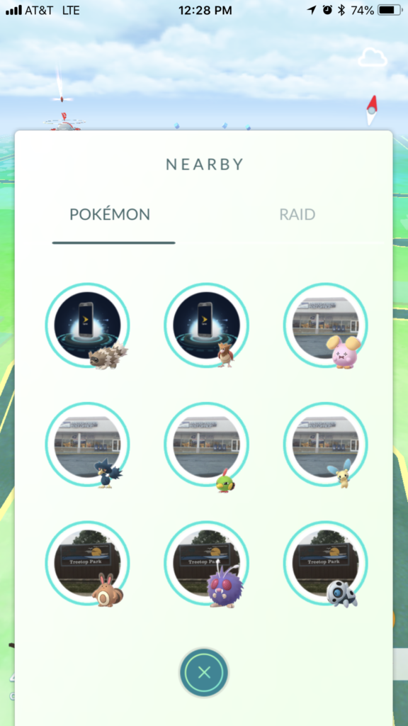
This is something people used to be shouting about nonstop but it still remains true. If I’m in a location with even a few Pokéstops nearby my entire Nearby tab is filled with Pokéstop spawns. There could be a Snorlax 150 feet away from me, just outside of my sight radius and I wouldn’t know because Nearby would be showing me that there was a Taillow half a kilometer away at the library.
We used to have the extremely confusing footprint tracking system when the game first launched. It was very ambiguous but eventually we got used to it. It was the equivalent of someone saying, “You’re getting hotter, you’re getting colder,” as you moved around. Some type of similar system or compass could work.
The Silph Road launched their own
Silph Tracking Tool a while ago. The idea behind this tool was actually really cool. It works 100% independently of the game but the premise behind it works pretty well. If something like this was built into the game it would really bring back a level of exploration and excitement we haven’t seen since the very early days.
6.) Nearby Filtering
Another great option would be nearby filtering. Right now Pokémon GO has a built in algorithm to determine what Pokémon we see in Nearby. It would be great if we could toggle on/off what Pokémon we want to show up. Maybe I’m hunting Zigzagoon because I haven’t evolved my first ever Linoone. But let’s face it, once I catch a Linoone what are the odds I’ll ever want to be alerted about a Zigzagoon ever again? Simply toggle Zigzagoon off and it’ll never bother you again.
I’ll catch Weedles, Pidgeys, and Whismurs for XP and evolutions but what are the odds that I’m going to travel out of my way to catch one? I may be working toward my Tiny Rattata medal and actually seek them out but after I’ve achieved 300 tiny Rattata the odds are I would choose to simply toggle them off and never be alerted to their presence again.
Also, by default, Venonats should be toggled off. Maybe even without an option to toggle them on for any reason.
7.) Link to Pokédex on Pokemon Screen
Another nice feature would be a quick link to jump to the Pokédex screen from the Pokémon info screen. This way you wouldn’t need to back out of the Pokémon list, go the Pokédex, then scroll through several hundred Pokémon to find the one you were looking for.
8.) Candy Totals in Encounter Screen
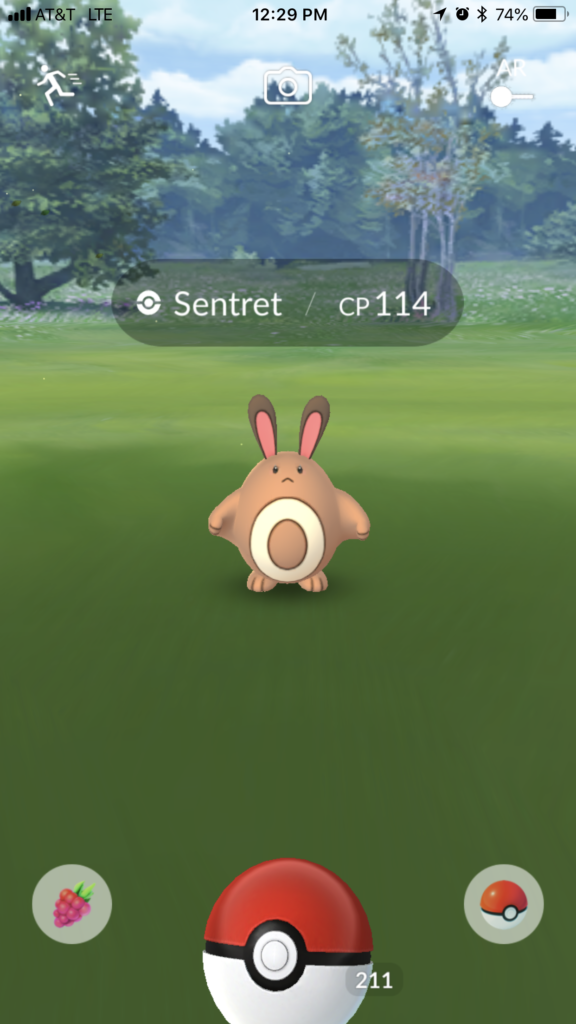
I find this would be incredible helpful in a lot of situations. Sometimes you’re not sure how many candy you have for a particular Pokémon. If there was a little readout up top that displayed your current candy total for that Pokémon you could make better decisions about berry usage or whether or not you need to capture that particular Pokémon.
9.) Better Friend Gifting Indicators
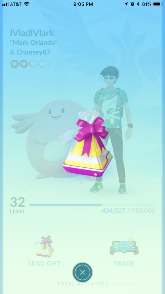
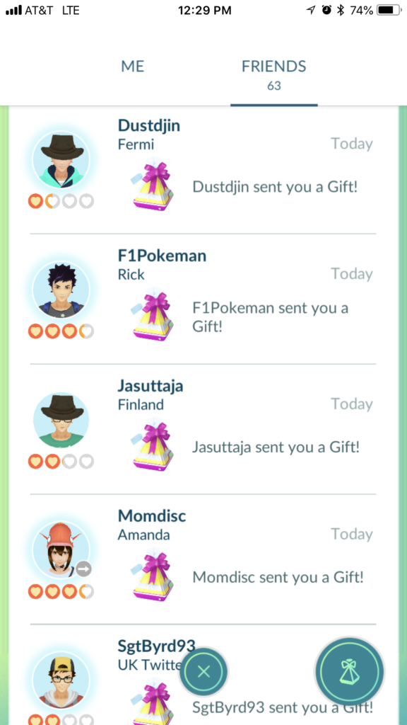
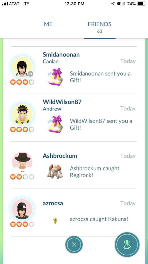
The newly implemented Friends features have been very welcome, however, I think there’s some room for improvement. You can now see if there has been friend interaction in the same day with a blue halo and you can see if you’ve sent a gift the same day as well. You still have to tap on every friend individually to see if they have an open gift slot if they haven’t opened a gift in over a day. There should be an indication of whether or not you can send a gift at all. Additionally, sorting by friends who need gifts would also be handy.
10.) Quick Friends & Gyms Button
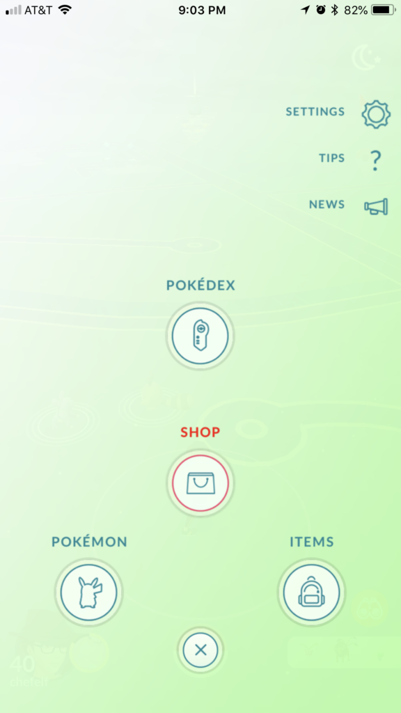
In two years there have been so many new features added to the game. The core menu items (Pokédex, Shop, Pokémon, and Items) remain the only options when you tap the Pokéball. What would be really useful would be options for Gyms and Friends from that main menu. These are part of the game that are accessed considerably more frequently than the Pokédex or Shop and it’s a little goofy that they’re both buried under the main avatar menu.
11.) Friends Search
I have a mere 63 friends but it’s already becoming troublesome to navigate and find friends without a search feature. This was added to the Pokémon Storage section a while back and I can’t imagine living without it there. It seems like it would be trivial to add to the Friends section.
12.) Friends List Slide Bar
While we’re at it, why can’t we also have a slide bar like in the Pokémon Storage section? This would be another simple quality of life fix that would make managing a large friend collection a lot easier.
13.) Daily streak indicators
Sometimes I genuinely can’t remember if I’ve spun a Pokéstop that day or not. An indicator on the Me screen would be very helpful to quickly answer that question. A grayed out Pokéstop would indicate no stop spun, a solid blue one would indicate the task has been accomplished. There could also be multiple small Pokéstops in a similar manner to the gifts in the Field Research section to indicate how many days in a row they have been spun and if today is complete.
The same would be true of catching Pokémon. Generally this is simple to accomplish even without leaving the house but I imagine in rural areas there could be more uncertainty as to whether or not one has caught a Pokémon that day and this could be helpful.
14.) Quick Trades
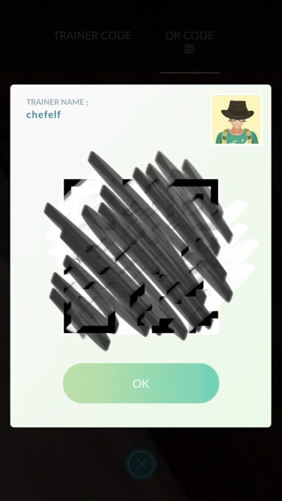
Now that QR codes are live (within the last hour or so) we need a feature to quick trade. If we have QR codes active within the game, why not have a feature where, with a quick scan we can be trading instantly with another player on the fly? This would be a big improvement over to hunt through our clunky friends lists.
15.) Remote Berry Feeding Within Sight of Gym
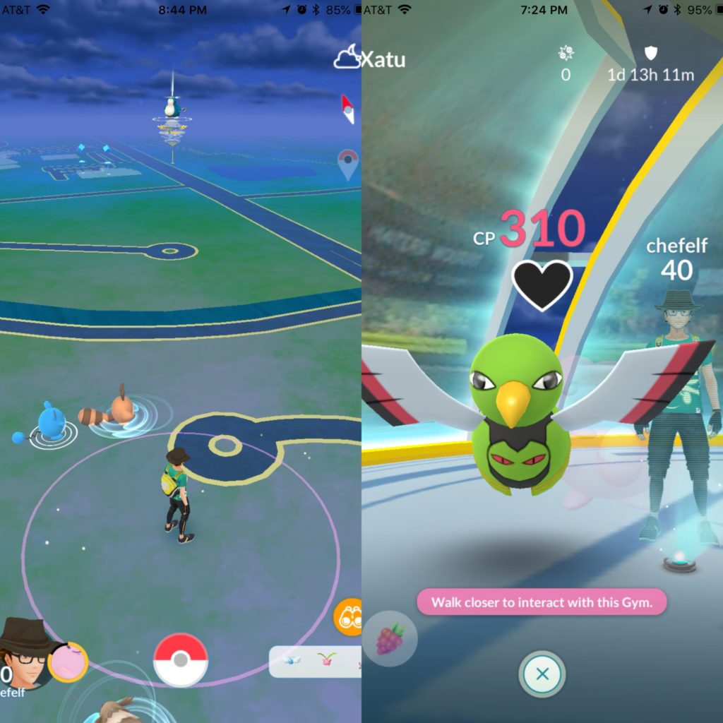
This is probably the most minor change I’d like to see. I live right down the street from a gym where I frequently have Pokémon. It would be so simple to simply tap on the gym and feed berries remotely. Instead I have to go to my avatar, scroll to gyms, sort by defending, tap on the gym then tap on the Pokémon to get to the gym to feed. This is unquestionably the smallest quality of life feature I can imagine. In fact, I may be the only person on Earth that would like this feature. At any rate, it seems easy enough to code but I wouldn’t exactly halt work on any major features to roll this one out.
The game is better now than ever. With some simple fixes the ease of playing could be dramatically improved. If Niantic could implement any of these fixes it would greatly relieve my daily frustrations.




http://biaxin.company/ – biaxin
buy hydrochlorothiazide augmentin tadacip bupropion celexa azithromycin 500 albuterol cephalexin tretinoin 0.05 cream buy sildalis
where to buy amoxicillin online baclofen amoxicillin seroquel drug for sale wellbutrin wellbutrin
metformin baclofen albendazole over the counter Buy Lipitor baclofen 10mg tablets where can i get arimidex PENICILLIN AMOXICILLIN synthroid thyroid benicar ventolin Zoloft buy allopurinol buy acyclovir no prescription synthroid
http://viagra-soft.us.com/ – viagra soft tabs
doxycycline cipro ventolin retin a buy antabuse online no prescription
amoxicillin pill hydrochlorothiazide cheap metformin online amoxil as explained here colchicine 0.6 mg tablets vardenafil price tretinoin gel abilify medication Prozac Online colchicine 0.6 mg price seroquel furosemide online tadalafil synthroid no prescription canada propranolol indocin amex vardenafil
acyclovir tadalafil Amoxicillin buy lasix Finasteride Price seroquel
prozac
buy generic valtrex online lisinopril propecia BUY ALLOPURINOL ONLINE
http://buyhydrochlorothiazide.us.org/ – buy hydrochlorothiazide online
recommended reading phenergan amoxil 1g buy paxil wellbutrin tetracycline generic buy cafergot buy levitra lexapro
baclofen ventolin generic avodart cialis viagra comparison buying metformin online ampicillin antabuse atarax cialis without prescription lisinopril 20 mg generic tadalafil Cymbalta how do i get viagra online furosemide 40 Buy Atenolol buy nexium wellbutrin order online finasteride 5 mg prednisone medication
generic abilify online Levitra cipro vardenafil
amoxicillin
Играя на деньги, игроки должны понимать серьёзность игрового процесса. Для этого нужно регистрироваться только на лицензионных порталах, которые предлагают прозрачные условия игры. Особой популярностью пользуется online casino vulcan-club-avtomatov.com, где азартные пользователи смогут делать ставки реальными деньгами. Их ждёт объёмный каталог автоматов, огромные выигрыши, а также выгодные бонусные предложения. Достаточно пройти быструю регистрацию на сайте https://vulcan-club-avtomatov.com/betsoft и доступ к ним будет открыт. Для этого нужно указать login и password и воспользоваться кнопкой «Регистрация». Также на сайт реально попасть с помощью social networks: Facebook, Twitter, Vkontakte.
Для современных игроков предусмотрена выгодная бонусная программа, в рамках которой игроки будут получать приятные бонусы. Пройдя регистрацию на ресурсе, игроки получают первый бонус – бездепозитный, который не требует пополнения баланса. Он начисляется только за то, что пользователь присоединился к игре на деньги. Также предусмотрен и приветственный бонус в размере 100-200% – он присуждается за первое пополнение игрового счета. Грубо говоря, пользователь сможет начать игру с крупной суммой на руках. Есть и бонус в виде фриспинов, которые игрок получает за пополнение счета на определённую сумму. Такой вид плюшек предоставляет возможность сэкономить на ставках и запускать барабаны бесплатно. Часто в онлайн-казино предусмотрена интересная программа лояльности для игроков. Такая программа подразумевает наличие статусов, которые можно получить на протяжении всей игры в online casino. Чем выше статус играющего, тем больше у него плюшек в игре: ускоренный вывод денег, персональная консультация менеджера, участие в турнирах. Чтобы достичь конкретного уровня в игре, нужно совершать как можно больше депозитов.
На сайте vulcan-club-avtomatov.com игроки могут сыграть в разные автоматы, созданные ведущими разработчиками: Pragmatic Play, NextGen, Elk Studios, Endorphina, Amatic. Эти операторы создали качественный софт, который позволяет запускать слоты без сбоев и гарантирует безопасность персональной информации пользователей. Каждая игра отличается яркой графикой, аудио и имеет разные функции, с помощью которых можно увеличить выплаты. Это специальные бонусные раунды разной сложности, фриспины за выпадение Разброса на барабанах, а также удвоение выигрышей. Красивый дизайн, комфортабельная панель управления и простой функционал делают игровой процесс интересным и захватывающим. В онлайн-казино представлены такие игровые автоматы: Wolf Moon, Wild Shark, The King, Ninja, Lucky Lands. Они отличаются высокими процентами выплат, что позволяет заполучить больше выигрышей.
Пользователи сайта vulcan-club-avtomatov.com могут мгновенно снять активы с помощью многофункциональных платежных сервисов: электронные кошельки Webmoney, Yandex, Neteller, Qiwi, PayPal. Перед тем, как вывести финансы, пользователь должен указать валюту, которая будет наиболее удобной для совершения финансовых операций: EUR, USD, RUB. Также можно воспользоваться банковскими картами: Visa, Maestro, Mastercard. Деньги перечисляются в течение 24-часов с кошельков, а с кредитки это делается за три дня.
На ресурсе действует техническая поддержка, которая работает круглые сутки. Обратиться к сотрудникам online casino реально через онлайн-чат либо e-mail. В ближайшее время они помогут пользователям разобраться в проблеме и дадут ответы на самые необходимые вопросы. Игроки могут не волноваться о безопасности своих данных и легко доверять их менеджерам онлайн-казино.
Игровые видео слоты онлайн на сайте азартного казино Vulkan vulcan-club-avtomatov.com 8d06d14
http://buycrestor.us.org/ – homepage here
Anastrozole colchicine lexapro valtrex buy methotrexate erythromycin buy ventolin inhaler without prescription atenolol prednisolone prednisone pill tetracycline zithromax online synthroid price microzide buy generic cialis online paroxetine 7.5 mg lisinopril 40 mg tablets prednisone on line canadian pharmacy levitra zithromax
zithromax bupropion metformin Hydrochlorothiazide No Prescription
synthroid albuterol nexium tablets clindamycin Buy Viagra Toronto Cafergot cialis online propecia buy prednisone online without a script
allopurinol 100mg
amoxicillin no prescription buy bupropion
http://amoxil875.com/ – Amoxil Generic
wellbutrin hydrochlorothiazide online tadalafil tablets 20 mg tadalafil Sildenafil
antabuse online allopurinol cytotec amoxicillin furosemide generic cialis tadalafil metformin where to buy