Let's see, let's see... so many things to say today...
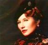
She looks a little sleepy there

But I noticed the curves on the feet before I read your description. They looked really good.
Yeah, that's Julia alright. I'm just glad that she didn't faint again. I think the number and width of the lines used for the feet made them look better than the rest of the picture, that's one of cons of this technique. The body curves all look rather dull after a picture or two, but I'm afraid I can't do anything about that, as I'm only trying to copy nature. And if I had added more lines, then it would have appeared as if the young lady had wrinkles... I don't even want to imagine that giant slap I would have gained from that... *shudders*
She definitely looks more real life than the other pictures, which were not that realistic when it came to the shapes of bodies.
Agreed.
But gee, who draws or paint real life people anymore.
Also agreed... well, I think I'd draw more pictures like this
if I had some models... but since I'm not in such a fortunate position, I'll just have to use my lewd fantasy.
I think it looks great. Thanks for enduring all those slaps for the sake of your artwork. You're a true art-hero.
If only Julia had thought so, too...

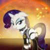
I think Dawn is the most fully-developed as a piece of art; the others are fairly static.
Yes, there just wasn't enough life in the other pictures, while Dawn featured that special pose, clothing --which took me one hell of a lot time to design-- and wet hairs. I think I should include more things like that in the next pictures.
As a technique for a comic, I think that monochromatic style could get overused and wind up distracting from your story. That or worse, it might be boring in the long run, while individual pieces here and there would really stand out.
At the risk of prejudicing your work, I'd say take a look at Frank Miller's "Sin City," particularly "A Dame to Kill For." The style is similar, but maybe you'll see what I mean about monotony. Maybe you've already seen it, and already agree or disagree with me.
Oh, I totally agree with you. I think I got the whole idea some time ago from Sin City. As for the idea of the comic... well, I discharged that even before I had finished drawing Dawn. This style just isn't suited for creating whole sceneries filled with life and even though it only consists of black and white images, a film-noir-esque story would be near impossible to create. The focus is on curves and contours, not light and shadow. I'd go nuts if I had to calculate all those things affected by proper lighting for a figure like Dawn...
Alright, that's it for the fan-mail then (
). And once again I have something new to present - just shout if it's getting boring, okay?
Oh my, this doesn't fit into the forum's table either... it's the biggest project until now.
Hell, this took me even more time than Dawn... Alright, instead of the usual boring stuff I say about my pictures, I'll illustrate the creation-process of this picture this time, since Mirithorn had asked for a little enlightment in the Q & A Session.
Step 1: Getting some inspirationThis is the fun part. All I have to do is to look at... ahem... "nature". So I look for some hot... ahem... "natural" pictures. Like this one.
Step 2: SketchingOnce I've got the notion of an idea, then I draw some sketches to point out the vital parts, the lines of the body, the pose, the facial expression, etc. etc. etc. Please do note at this point, that my handdrawing skills really do suck. So these sketches are turning out to be some very cryptic scribblings most of the time. Here's the sketch I made for At the Edge of Time.
As you can see, I've only pointed out the most basic lines, just to give me a feeling on how I should translate an idea to a picture that looks somewhat realistic. The young lady was supposed to represent a little contradiction, as she was reaching for something in the distance and drawn back by her origins at the same time. If I had drawn the picture like this, then it would have seemed as if she was just casually standing somewhere and... well... reminding people of a certain greeting, which would have been the cause for a certain disaster, as I'm of a certain nationality...
Anyways, I've pointed out that she should arch her back a little more to compensate this. Then I've made some more notes regarding her hips. If you compare this sketch to the final picture, then you can see that I've decided to make her stretch out the right leg a little more, while the lion's share of her bodyweight presses on her left leg. It's a part of her irresolution. If I could have been arsed to draw the lower parts of her legs and her feet aswell, then she'd only stand on her toes with the right foot.
Then I've made some more points to discuss the nature of her character, as can be seen on the right.
Step 3: Getting to work... mehI usually start with drawing the torso, in order to set the dimensions. The right arm followed, as it was important for the direction of her head. I've had no model this time, so I had to look at my own hand again... *sigh*
I've made a photo to make things easier and tried to copy the important lines. Fingernails, the length of the fingers and the size of the whole hand were things that I had to manipulate another twothousand times in order to make it appear a little bit more feminine.
Now it was time for the hair and the contours of the face. I can't draw faces just like that into the open air, it just looks plain awful. It's always better for me to have the surrounding hairs and lines of the neck first.
Here you can see how I manipulate the lines to give them their specific look and twist.
Once that's done, the construction of the face starts. Two eyes, two eyebrows, a nose and lips. That's all there is, but I usually spend around 70% of the time just on those parts. Hell.
Here's a picture of the process. The helpine is still visible and she hasn't got a nose yet. Oh, and her breasts needed some fixing, too. And I must say that I'm rather proud of her hairstyle. It suits her character.
Finally, it's time for the last adjustments.
I really couldn't be arsed to draw more of her legs - the picture was already big enough. I've used about 210 lines to carve out all of her body.
Step 4: Special effectsAh, this is were it all began to get really interesting. As you can see, I've used different images to represent different parts of her body. Starlight in her eyes and various pictures of nebulas for her hair, her body, her lips and fingernails and the little accessoires she's wearing. Now I'm afraid I can't explain that too much, as it all would get a little bit too theoretical.
Phew... I guess I could go on rambling like this for another few pages, but I don't want to torture you any more.
This post has been edited by Gobbler: 26 February 2006 - 08:20 AM
 Sign In
 Register
 Help
Help


 Gobbler


 MultiQuote
