trilby fanart
#256
Posted 24 January 2008 - 11:56 AM
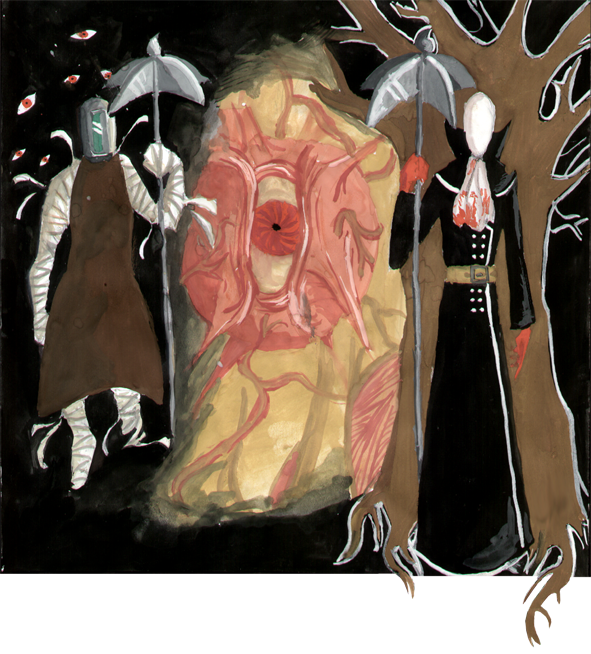
Ok, not the best drawing I've ever made, but meh. Oh yeah, and the colors suck because it's drawn with paint, and I suck at drawing with paint.
#258
Posted 24 January 2008 - 12:36 PM
#261
Posted 25 January 2008 - 05:33 AM
Nah for a second after I read the post I thought he meant Microsoft paint but then I looked at the picture and realised he means the good ol fashioned paint. It’s a great bit of fan art this it mostly highlights how much cooler the tall man is than the... bandaged man. Or whatever his name was again.
That is one badass baby.
#262
Posted 25 January 2008 - 09:44 AM
Had you said "I suck at painting", then this little misunderstanding would have been avoided.
#263
Posted 25 January 2008 - 10:22 AM
#264
Posted 03 February 2008 - 05:29 PM
I hardly ever play video games, but I LOVE the Chzo Mythos series! And for some bizarre reason, I got a really clear picture of Trilby in my head.
(It's colored with Prismacolor pencils, if you were wondering. The text was added digitally.)
#265
Posted 03 February 2008 - 05:47 PM
#266
Posted 04 February 2008 - 02:02 AM
Chemartist, I could see the outline around Trilby as a stylistic sort of thing. It's thick and irregular enough in most places that it looks like you cut it out with scissors, rather than a bad copy-and-paste job in Photoshop. But I have to say, the guy looks kind of like a gnome.
#268
Posted 04 February 2008 - 10:11 AM
It's a really good picture (I envy the shading, and the coloring is excellent), just watch the proportion (human anatomy books, and life drawings help a LOT), and study the subject matter you don't know a little bit more (like the trilby, and the tie's knot). Cropping with Photoshop / Gimp is tricky, but it is possible, just be really diligent with the pen tool and make a mask -- so that you can fix the cropping without actually ruining your image. Also, move him down a little bit so that he isn't floating above the edge of the page (what bob said).
Good work everyone, and Jenx, add some depth to that painting, it looks a little flat to me. When you paint, you start with the lighter colours, and then go gradually darker. Never use full black otherwise it'll be way too dark to fix if you make a mistake.
I'm done now.
#269
Posted 04 February 2008 - 11:34 AM
Also, if I generally really cared about the pic I would probably do some touch up jobs, but seeing as how I did this just to get my marks, I doubt I will. Thank you all for the feedback though.
Now, Chemartist, I am WAY too lazy to give a nice and lengthy overview like Bob did, plus his covers most of it. So all I'll say is this - It's a great drawing. But it's not Trilby. A character is defined as such not only trough his acting, speech and behavior, but also by visual keys which make him or her the character he or she is, and not someone else.
..now if only cosplayers would get that into their thick skulls.
#270
Posted 04 February 2008 - 12:10 PM
I know I wouldn't... But I'm a bit of a stickler for perfection, and spent a lot of time working on cutting images out in Corel PHOTO-PAINT (subliminal advertising?) which took a long time, but was generally worth it. I mean with colour on white, it's easy, but when you do something like a fairly dark figure on a dark background, some of the edges are almost impossible to see! And undos are sadly limited... Anyway, I'm rambling... I'm unlikely to do fan-art, but if I did, my medium would more likely be pastel (for a colour one) or pencil. Painting is annoying, and takes too long... Mistakes are also worse and harder to hide. Then again pastel's a bitch if you accidentally lean on it! I'd rather stick with graphics packages on computers, doing mediocre jobs well. Then realising that - as perfect as my projects are - they royally suck! Oh, and I would only allow geniuses into the institute, artistic ones of course...